

Colorado Culture Change Coalition Case Study

Project type
Non-profit Rebranding
Role
Associate Designer
Programs Used
Adobe Illustrator, Adobe Photoshop & Canva
Date
March-May 2025


Overview & Objective
The Colorado Culture Change Coalition is a nonprofit dedicated to improving care culture in nursing homes and long-term care settings. They came to our team seeking a full rebrand that better reflected their values of empathy, dignity, and community. Their old identity felt clinical and disconnected from the warmth they wanted to represent. We helped refresh their brand to feel more modern, human, and accessible.
Objective: Redesign the brand identity of the Colorado Culture Change Coalition to reflect better its mission of advocating for elder dignity and person-centered care, while creating a visual system that resonates across generations and encourages greater public engagement.
Phase 1: Research
The research phase began with a deep dive into the heart of the Colorado Culture Change Coalition—understanding both what the brand stood for and why it no longer resonated. To start, I did narrative research by watching pieces of content on their website that included documentary-style videos featuring elders sharing their life stories, along with interviews and visual media from the coalition.
These firsthand accounts gave me emotional insight into the community’s culture and purpose. To better understand how broader elder-focused branding connects—engaging broader audiences—I also analyzed the animated film Up, drawn to its emotional storytelling techniques and visual symbolism.
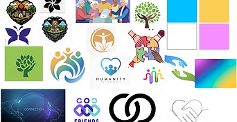
In addition to narrative research, I studied color psychology to determine which hues could evoke warmth, community, and trust across generational lines. I also explored logos and branding systems that successfully represented unity and grassroots connection—even if the final design didn’t follow those exact routes, they still informed my understanding of how branding makes people feel seen.
Below are my notes and ideas. Feel free to click to enlarge them.


Phase 2: Concept Development
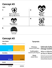
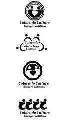
After gathering insights from real-life elder stories and cultural references, I began visually interpreting how the brand could be perceived, focusing not just on what it should say, but also on what it should emotionally evoke. The first round of sketches explored symbols of care, connection, and community. While the initial batch of logos leaned heavily on literal interpretations, client feedback prompted two rounds of revisions that challenged me to think more deeply about emotional storytelling. The team and I began exploring abstract forms that could symbolize community and unity, such as circles, linked figures, and shared spaces.
I realized through this process that I’m an emotional designer, driven by how color and form can shape perception. That led my team to entrust me with developing the color palette while they focused on refining the hexagon-based logo, which symbolized community through the structure of a beehive. I concentrated on blending tones that felt warm, energetic, and inclusive, anchoring the brand in emotion and approachability. One can see the evolution through my increasingly refined iterations, where I explored multiple color options to craft a bold, youthful logo. What emerged was a brand system that aimed to uplift, not just represent, elderhood.
Below are my sketches and concepts. Feel free to click to enlarge them
_JPG.jpg)


Phase 3: Collateral Design
In the final phase, I focused on digital collateral, designing social media templates, custom illustrations, and a button for their Stop The Blame Campaign, while my teammates handled more technical deliverables such as flyers, letterheads, and the website. Our biggest challenge was balancing our creative tone. While I leaned into playful, youth-oriented visuals, my teammates approached the project with a more businesslike and structured mindset. We had to meet in the middle through collaborative revisions, blending personality with professionalism.
To ensure accessibility for the nonprofit, we chose Poppins as the primary typeface for its readability and designed everything using Canva. This decision allowed the client to easily access and update assets on their own long after the handoff.
Before & After Final Logo (slide to see)
Social Media Template Mockup


Stop The Blame Campaign Button

Characters Illustrations


Reflection
This project helped me understand that I design with emotion and strategy. I turned audience insights into visual systems that feel authentic and engaging. Working with a team that approached things more technically pushed me to defend creative choices with purpose and clarity. I discovered that my strength lies in using storytelling, research, and design thinking to shape brands that connect with people and stand out with intention.
Designed by Breanna Williams © 2025.