

Kera Care Case Study

Project type
Rebranding & Case Study
Role
Designer, Researcher & Stratgeist
Programs Used
Adobe Illustrator & Adobe Photoshop
Date
March 2024
Overview & Objective
KeraCare is a legacy haircare brand that targets textured hair, but its outdated packaging and limited visibility have kept it from connecting with the very audience it was made for: young Black women. As someone who has used KeraCare since I was three years old, I wanted to reimagine the brand through a personal and cultural lens. This redesign gives it a vibrant, affirming identity that celebrates natural beauty, embraces modern Black culture, and brings well-deserved attention to a product that has quietly supported textured hair for generations.
Objective: To modernize the KeraCare brand in a way that authentically represents young Black women with textured hair. This rebrand aims to address the lack of inclusivity in the beauty market by creating visually distinct packaging and messaging that empowers users to reconnect with their natural hair. The goal was to design a brand experience that not only looks modern but also makes consumers feel seen, valued, and confident in their hair journey.
Phase 1: Research
I began with an in-depth brand audit of KeraCare, a legacy haircare line created for textured hair. Despite its mission to support healthy, beautiful styling, the brand lacked a cohesive and emotionally engaging identity. Its outdated packaging blurred product distinctions and failed to capture the attention of younger Black consumers who are deeply attuned to aesthetics, authenticity, and inclusivity.
To contextualize KeraCare’s position in the market, I conducted a comparative case study on two major competitors: Organic Root Stimulator (ORS) and SoftSheen-Carson.


Organic Root Stimulator
-
Established: 1966 by Gary Gardner to address the lack of products for textured hair
-
Target Audience: Black women seeking accessible, natural haircare for daily use, especially those balancing affordability with scalp health.
-
Visual Identity: Uses dominant green to reflect nature, renewal, and wellness. The minimalist teardrop in the “O” symbolizes precision and nourishment, reinforcing the brand’s focus on scalp health and intentional product design.
Tone & Appeal: Calm, nurturing, and rooted in wellness; remains a Black-owned company, maintaining authenticity and trust Brand Values: Self-love, individuality, and expression for women of color Brand Mission: Create natural, non-toxic remedies that nourish skin and scalp
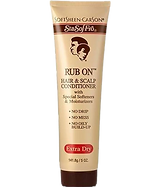
SoftSheen-Carson
-
Established: 1964 by Edward Gardner to provide Black women and men with haircare during a time of exclusion, later acquired by L’Oréal
Target Audience: Young Black adults (mainly women) with textured hair
-
Visual Identity: Leans heavily into heritage branding. While it appears outdated to younger audiences, it utilizes brown to reflect products' naturalness, stability, and reliability, anchoring itself in a legacy of trust with consumers
Tone & Appeal: Originally empowering and bold; now perceived as more corporate and distant post-acquisition Brand Values: Confidence, uniqueness, and beauty without compromise Brand Mission: Empower people of color to embrace individuality through innovative products
Key Market Inisghts
While textured haircare has become more visible in the mainstream, there’s still a clear and urgent gap in the beauty industry for Black-owned brands that truly resonate. Many new brands struggle to compete, while older brands are often acquired by non-Black-owned corporations, leading to a loss of cultural authenticity and emotional connection with the communities they were created to serve.
Current industry statistics reinforce this insight:
-
Only 2.5% of beauty market revenue comes from Black-owned brands
-
11% of U.S. beauty consumers are Black
-
19% say it’s hard to find products that work for their hair
[Source AfroLovely]
These insights revealed more than just a market opportunity, they exposed a need for brands that do more than offer products. KeraCare is still Black-owned, built on trusted formulas, and rooted in a deep legacy, yet its identity no longer resonates with today’s generation. As someone who grew up with the brand, I knew how valuable it was, yet how invisible it had become. This inspired me to create a new visual direction that honors its history while connecting with young Black women through bold design, cultural pride, and a renewed sense of belonging.
Visual Research
As part of my research, I gathered visual inspiration from Pinterest, Behance, and other online platforms, studying beauty, haircare, and letterform logos. I wasn’t just looking for what looked good, I was looking for ideas I could pull from and remix into something that felt true to KeraCare. I focused on logos that used elegant typography, bold letters, and imagery tied to femininity and hair texture. I explored how different brands used symbols, color, and form to communicate identity, and started thinking about how I could combine the elements I liked such as strong serif type, natural silhouettes, and Black woman representation, into a logo that finally gave KeraCare a recognizable and culturally meaningful face.

Phase 2: Ideation & Concept Development
After researching visual trends and identifying a gap in culturally relevant branding, I began exploring how to bring KeraCare into a more modern, intentional space. I started sketching logo concepts based around the letter K since the original brand didn’t have a true logo, just a wordmark. Keeping the K allowed me to maintain a sense of brand continuity while giving myself creative freedom to develop something fresh and representative.
Through rounds of sketching, I experimented with ways to merge the K with afro textures, natural curls, and the profiles of Black women symbols that reflected pride, softness, and identity. I wanted every stroke to speak to the community this brand was built for. I also began developing name and tagline concepts. While I explored playful options like Kurly Girly and Kurls for Girls, the name that stuck was Kute! (Kinky. Kurly. Worthy.) It felt bold, affirming, and spoke directly to the confidence and beauty that textured hair deserves.
Furthermore, color played a major role in shaping the tone of the brand. I chose rich purples to evoke royalty, creativity, and self-worth. This color is also historically associated with pride and power in Black culture. I paired it with vibrant yellows and golds to represent joy, energy, and warmth, creating a palette that feels both luxurious and emotionally uplifting. Beyond their symbolic meaning, these colors also serve a functional purpose by helping differentiate between the shampoo and conditioner, adding clarity and cohesion across the product line. Every design choice, from the curves in the K to the silhouette in the logo, was made to ensure Black women feel seen, celebrated, and powerful.


.png)
Phase 3: : Refinement & Final Design
As the brand system came together, I refined each element to feel more intentional, confident, and culturally grounded. The layout was structured to prioritize clarity, giving product benefits strong typographic weight while keeping the design visually balanced. Floral patterns were added for elegance and texture, adding depth without overpowering the core visuals.
Each element, from the imagery to the hierarchy, was placed to balance emotional connection with functional design. At the center of it all is the final logo, created by transforming the letter K into the silhouette of a Black woman wearing a headband. The K wraps around her profile, with her natural afro forming the bold outer shape. This design anchors the brand in identity and visibility, turning a single letter into a symbol of culture, pride, and empowerment.
While the logo plays a key role in the brand identity, I intentionally chose not to place it on the front of the product packaging. The focus was on emotional connection through photography, clear labeling, and color-coded design. The logo instead lives across branded spaces where it can stand alone and reinforce recognition without visual competition.
Before & After Final Logo (slide to see)
Reflection
Reimagining KeraCare let me pour myself into something that felt personal and needed. I’ve used their products since I was three, so redesigning the brand was more than a project; it was a chance to create something that could help Black women feel seen, valued, and celebrated. Every choice I made was about honoring that, through color, type, form, and voice. I wanted the identity to feel proud, modern, and rooted in culture, and this process reminded me how design can be more than visual; it can be affirming. It showed me the kind of impact I want to keep creating.
Designed by Breanna Williams © 2025.